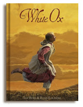
This is a new painting for the Friend magazine, a great little story about an immigrant girl (imagine that, me illustrating a story about pioneer immigrants) I like the colors and the composition, it got a little tight (a bit over worked) but I still like it.


5 comments:
I like all of the different boxes, they're pretty sweet.
Thanks Hannah. I like old trunks.
the lighting seems a little off. :)
it's great. the birds-eye is good! you're so good at composition.
Thanks Emily, I had to fake it besides, water tosses light from all directions...besides, who's going to notice a few inconsistencies??? oh yea, you did...
thanks for the good stuff.
Post a Comment